|
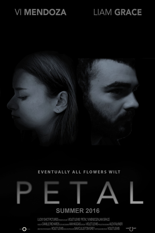
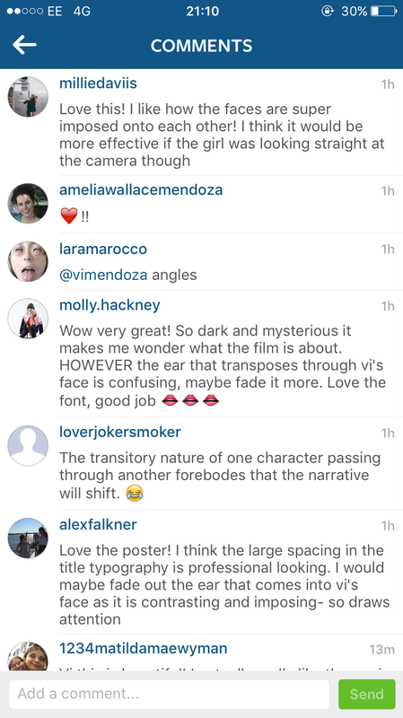
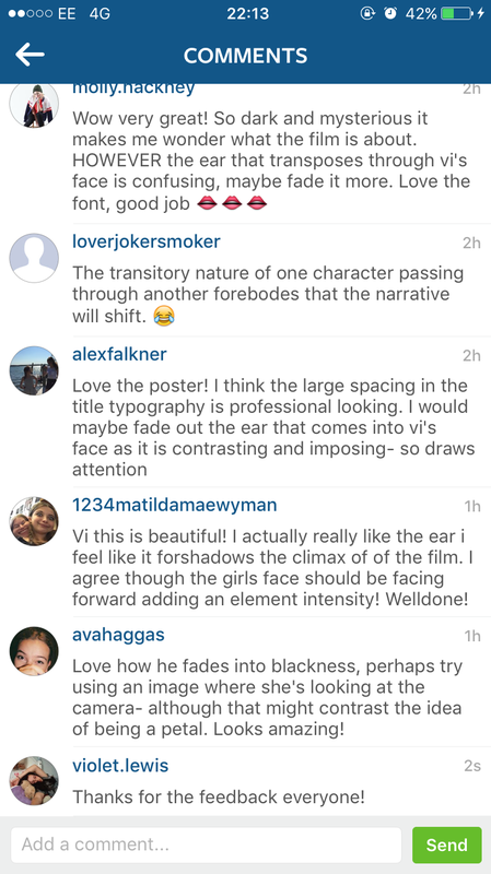
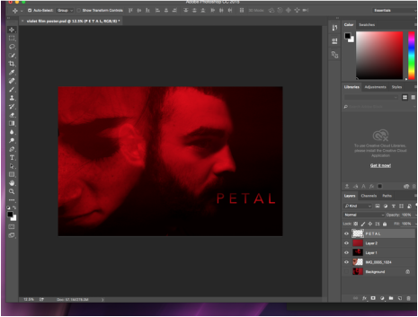
After getting audience feedback from my film poster, I decided to make some changes. Some of the feedback suggested that the girl should be looking at the camera and that Liam was a bit to over powering in the poster, especially his ear. I took this into account and decided to take a different picture of Vi. I don't want her looking at the camera but I want her whole face to be in it like Liam's is. The new photo I took is below. 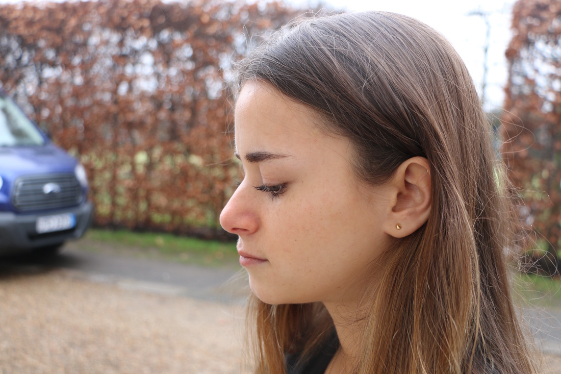 After photoshopping Vi and Liam's faces together again like I did with my last poster, I decided to make it vertical as oppose to horizontal. This is called 'The One-Sheet' which is definitely the most common among sizes of US movie postera, measuring 27 inches by 40 inches. It represents the standard movie poster size used in U.S. movie theaters today. I also made a horizontal one so I had the choice between the two. 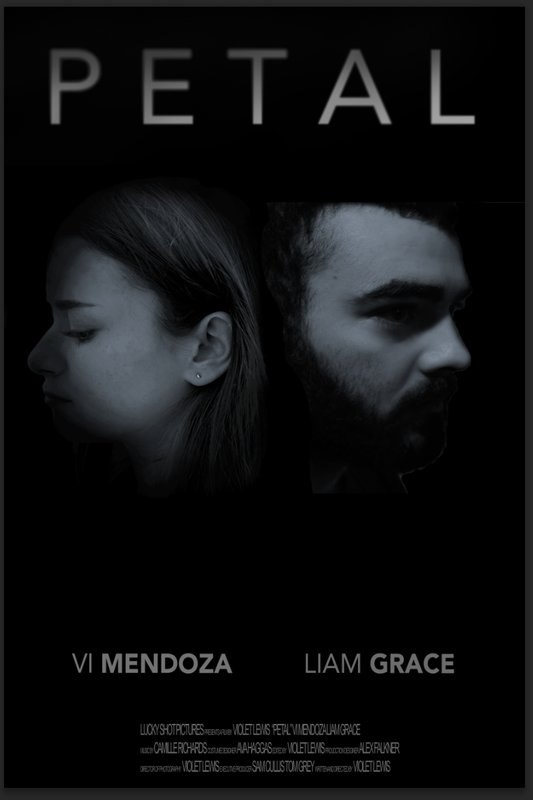 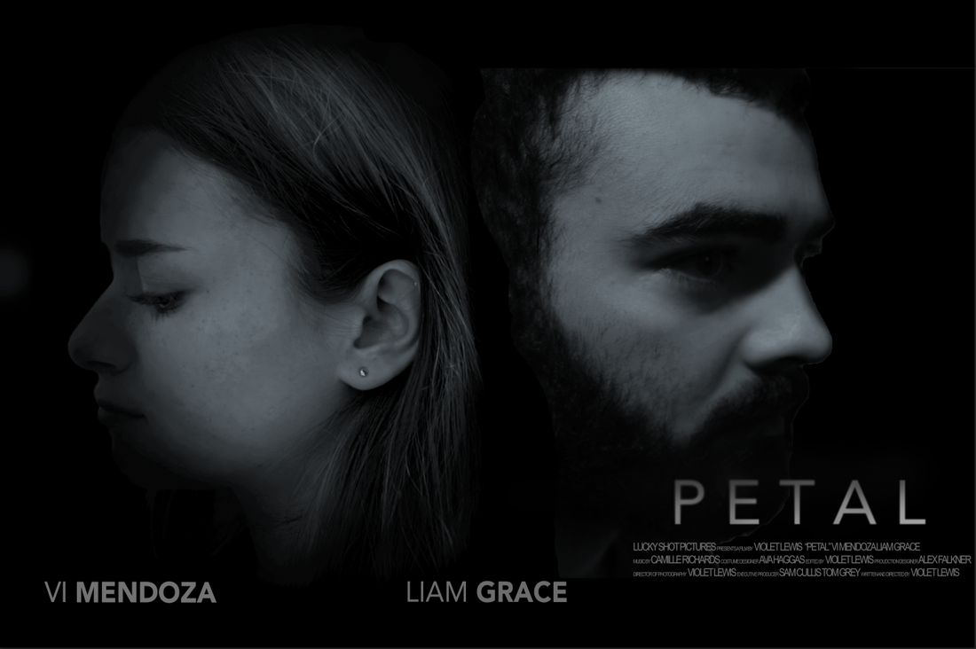 During editing my short film, problems with the music that my friend Camille composed started to arise. This is because although the piano sounds great, the different melodies that we recorded were all too short making it hard to use them for the whole of my film. Also, there were clips of the music that would gradually get more intense and then once the music got really intense it would just end meaning there was no gradual decrease of the intensity making it sound very unnatural on my film. 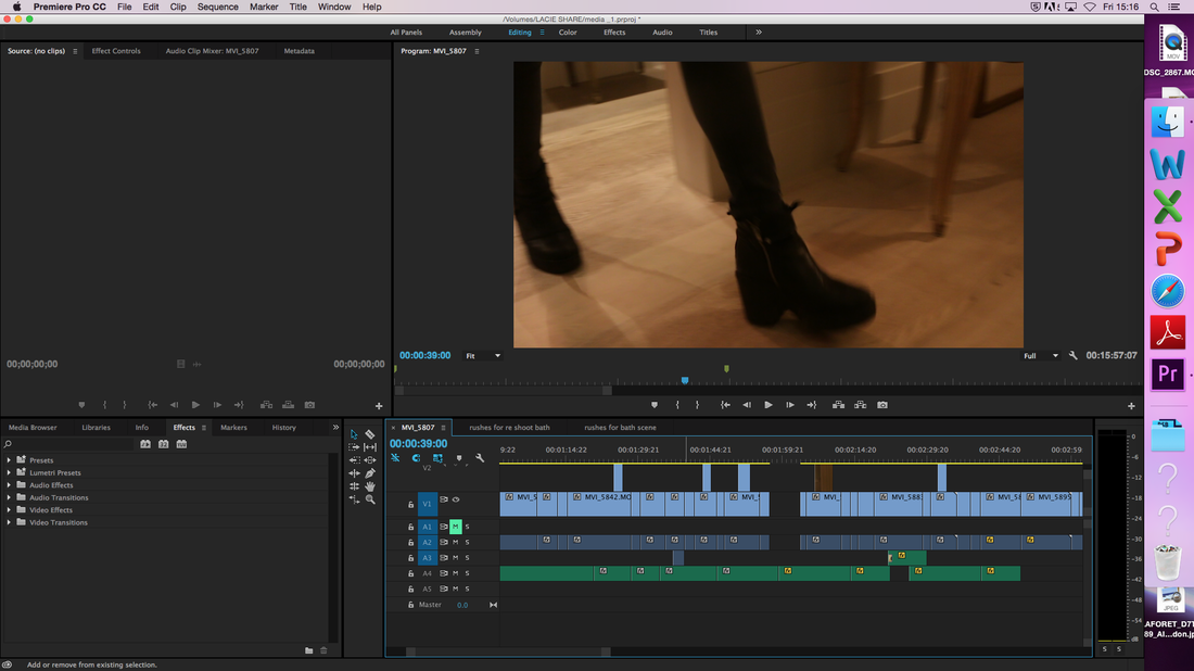 I used Instagram to get audience feedback for my film poster. This is because I thought it would be an effective way to get people's thoughts on it as the people who follow me on Instagram are also my target audience. Several people commented with their opinions and what they liked or don't like. One reoccurring comment was that the actress should be looking at the camera. This has made me question whether I should change the photo of her. Also, some people think that Liam's ear is too visible making it distracting. I have taken all the comments into account and will think about them when I complete my final copy of the film poster. 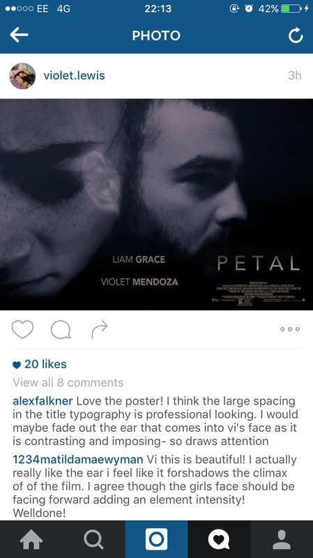
I screen recorded some of the process of me creating my film magazine review on the software indesign.
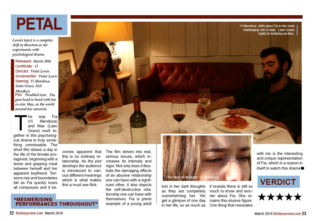
I decided to make it black and white with a hint of blue. The film poster is still intense but in a different way to when it was red. I have also added the cast names. 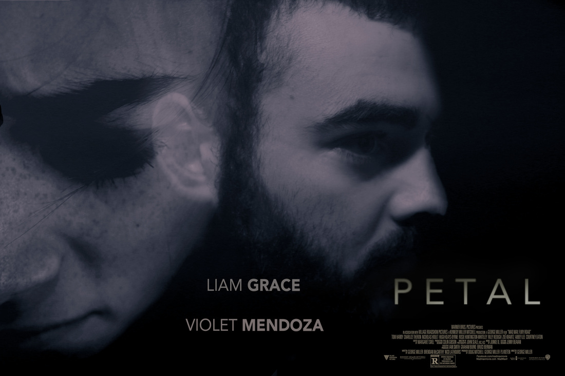 Before I started to use softwares to create my magazine review, I did some quick sketches to give me an idea of where I wanted pictures to go and where I would put the text. I like the idea of having the main photo go over into the second page.  I am going to create a magazine review for my short film. The purpose of a film review is to support movies going public and to let audiences know what to watch and what is good. Typically film reviews are found in Newspapers such as The Sun and The Guardian or official magazines such as Sight and Sound. Also sites such as Rotten Tomato's. Each form tackles the review and they are laid out in various forms to incorporate their audience. In most film reviews there is a large use of images from the film. The images give the reader a sense of the genre of the film showing key events from the film.  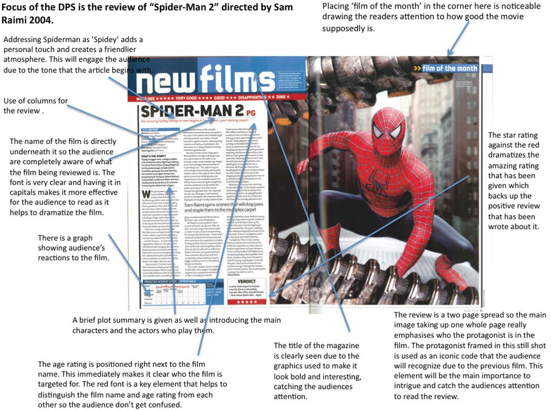 |
AuthorWrite something about yourself. No need to be fancy, just an overview. Archives
April 2016
Categories |
 RSS Feed
