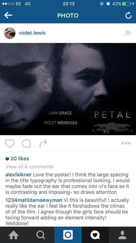
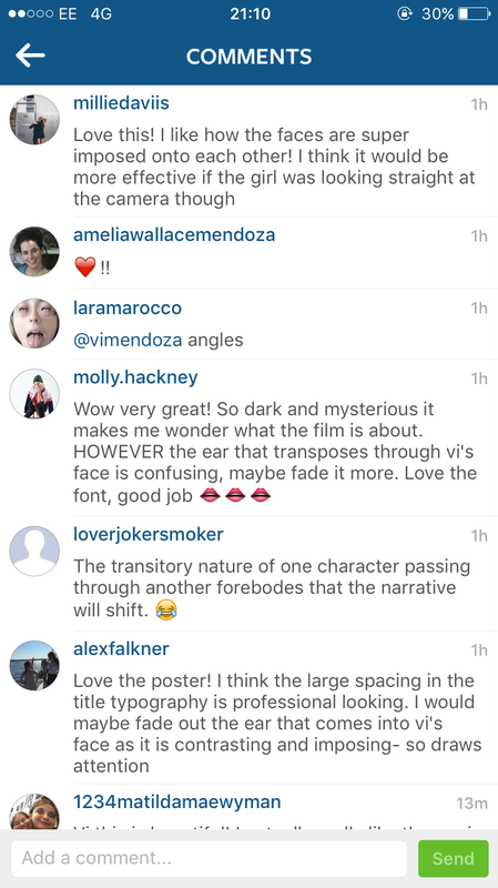
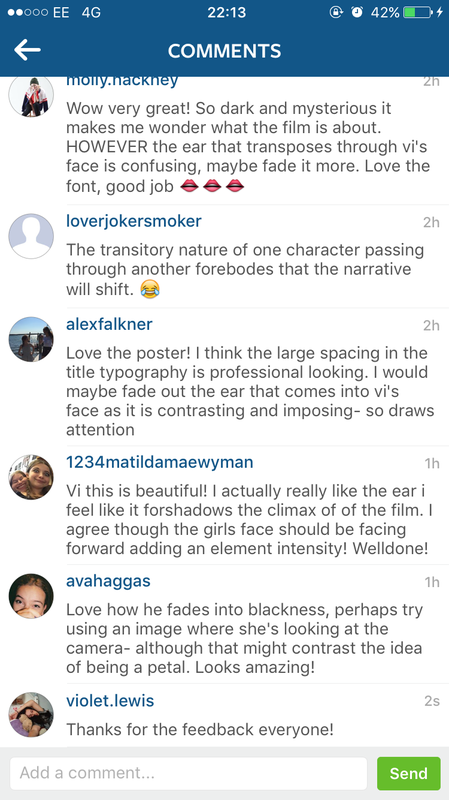
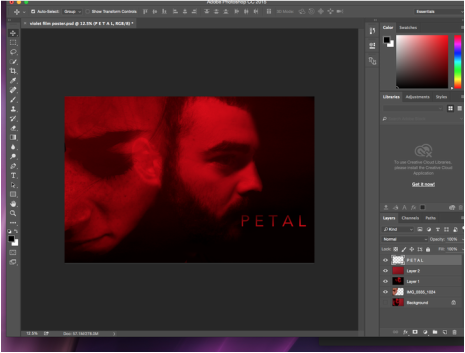
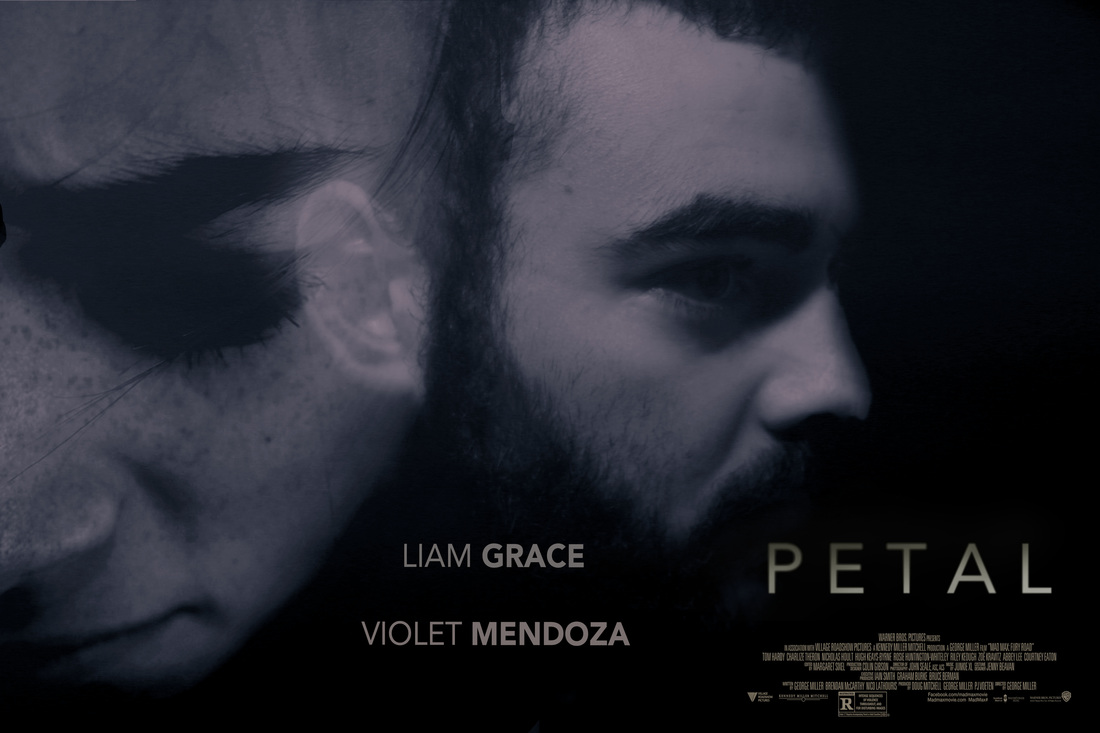
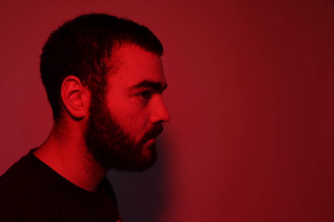
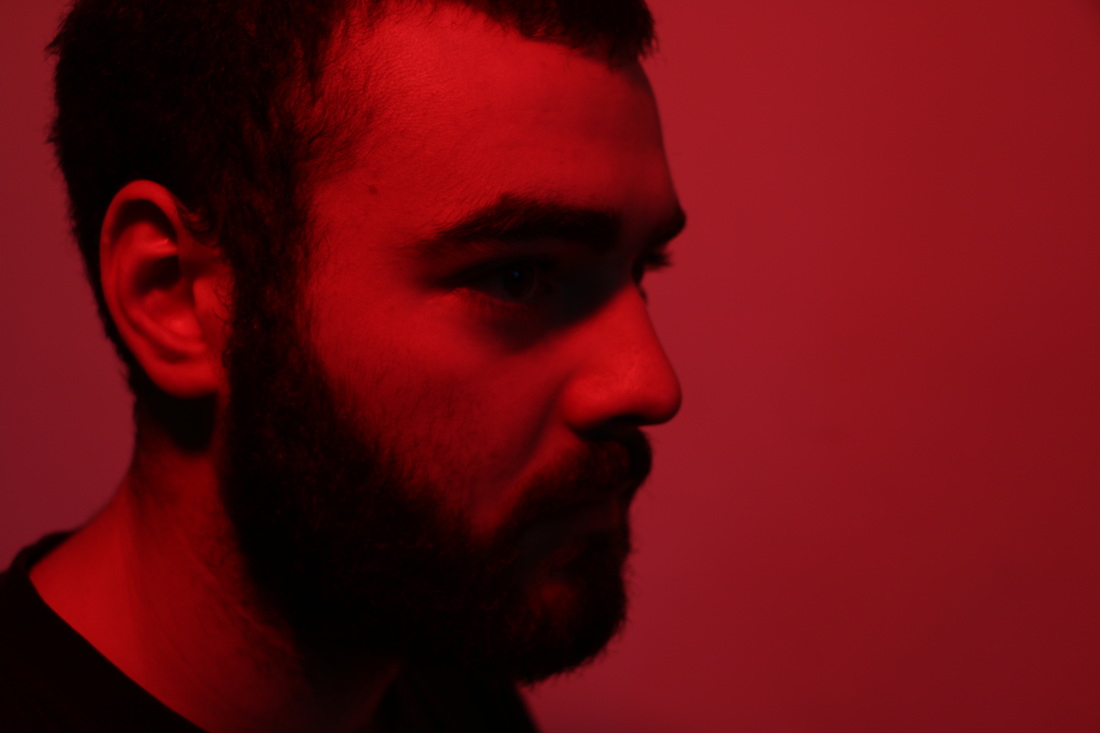
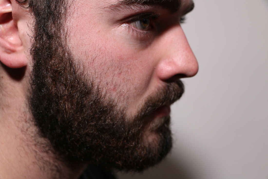
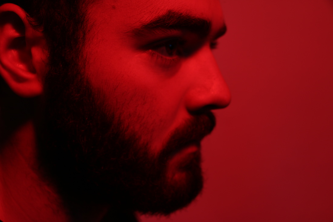
I used Instagram to get audience feedback for my film poster. This is because I thought it would be an effective way to get people's thoughts on it as the people who follow me on Instagram are also my target audience. Several people commented with their opinions and what they liked or don't like. One reoccurring comment was that the actress should be looking at the camera. This has made me question whether I should change the photo of her. Also, some people think that Liam's ear is too visible making it distracting. I have taken all the comments into account and will think about them when I complete my final copy of the film poster.
0 Comments
I screen recorded some of the process of me creating my film magazine review on the software indesign.
I decided to make it black and white with a hint of blue. The film poster is still intense but in a different way to when it was red. I have also added the cast names.
Before I started to use softwares to create my magazine review, I did some quick sketches to give me an idea of where I wanted pictures to go and where I would put the text. I like the idea of having the main photo go over into the second page.
I am going to create a magazine review for my short film. The purpose of a film review is to support movies going public and to let audiences know what to watch and what is good. Typically film reviews are found in Newspapers such as The Sun and The Guardian or official magazines such as Sight and Sound. Also sites such as Rotten Tomato's. Each form tackles the review and they are laid out in various forms to incorporate their audience. In most film reviews there is a large use of images from the film. The images give the reader a sense of the genre of the film showing key events from the film.
To create my film poster I wanted to take photos of my main characters in the photography studio at my school to ensure the best quality photograph. Below is a time-lapse of me photographing Liam ( the actor in my short film) I used my Canon 70D camera to take the photos and with the help of a photography teacher I was also able to use a spotlight to create shadows making the final product more dynamic. Also, we experimented with different colour gels which are put over the light making the photograph different colours. I really like the way the red ones came out as they make the photograph seem more sinister. I also took photos of my actress.
After brainstorming I have decided to call my film 'Petal". This is because I feel the word is a metaphor for my actresses life therefore is an appropriate title for it.
For my first ancillary task I am going to make a film poster. Film posters are used to promote and advertise a film. Studios often print several posters that vary in size and content for various domestic and international markets. They normally contain an image with text. I decided to research and look into real media products’ film posters. Below are examples of films with different genres film posters so but I am specifically looking at dramas, as my own short film is comes under that genre. Film posters are vital for the promotion of a film and for creating the first impression of the film. Here are examples of where they are seen. The first film poster I am going to look at for inspiration is from the film called Martha Marcy May Marlene- a drama thriller film. The movie title here interestingly isn't prominently featured and is quite subtle as it's in the bottom left corner. However despite this, despite the fact the title isn't large it is still effective as the font is in capitals and is thick rimmed. Also, the first word of the title 'Martha' is in a bold purple which stands out against the great background which draws your eyes immediately to the title. This shows how the title doesn't necessarily need to be huge and in the centre of a film poster to be effective. It also highlights that the name 'Martha' is of The main character of this film is a large part of the film poster which is a common theme among film posters generally. You can also see on the far right a male figure who has been deliberately blurred with a shallow focus. This tells us as the audience that he will be an important character making him intriguing but also mysterious as he is barley visible. The framing of the main character here is interesting as we have a close up and also a mid shot purposefully merged together portraying how the film is about her mind and perhaps her body and how she has maybe got mixed emotions. In addition, on the poster you are also told the name of the actress playing the main character and how may stars the film got. This is another technique to draw people in to watch the film. Also, it is unusual to put all the text in the corner implying that this is an unconventional film. This idea is further depicted due the earthy colours used again implying an indie and unconventional film as it makes it seem very dream like. Lastly the use of the double exposure for the images of the girl make her look even more vacant in her expression which explains the premise of the film in one simple visual image. |
AuthorWrite something about yourself. No need to be fancy, just an overview. Archives
April 2016
Categories |